/

Design System

Building a Scalable Design System for Consistency and Growth

Building a Scalable Design System for Consistency and Growth

Developed a comprehensive design system to unify six distinct products with unique brand identities. The system enhances consistency, streamlines collaboration, and accelerates development by providing reusable components, standardized guidelines, and a structured Figma workflow.

Introduction

A Design System is a structured collection of reusable components, guidelines, and assets that helps teams create consistent, scalable, and high-quality user experiences across multiple products. It ensures that design and development teams work efficiently and cohesively, reducing inconsistencies and redundant efforts.

With six different products operating under distinct brand identities and multiple stakeholders involved, maintaining design consistency has become increasingly complex. Each product follows its own UI/UX principles, components, and branding, leading to fragmentation, inefficiencies, and inconsistencies across the organization.

To solve this, we are building a scalable, centralized Design System that will:

  • Unify design principles across all products while allowing flexibility for unique branding.

  • Improve collaboration between designers, developers, and stakeholders.

  • Ensure design efficiency by reusing components, reducing redundant work.

  • Streamline approvals with a structured workflow in Figma.

This document outlines how our Figma-based design system will be structured to accommodate a wide range of product requirements, ensuring seamless design operations across the organization.

Challenge

1. Fragmented Design Processes

  • Different products operate with independent design languages, leading to inconsistency.

  • Lack of standardized UI components, requiring designers to reinvent designs for each product.

2. Inefficient Collaboration & Stakeholder Approvals

  • Multiple stakeholders per product create bottlenecks in the approval process.

  • No structured review system, leading to misalignment between design and development.

3. Lack of a Clear Workflow

  • Design files are often scattered across Figma, making navigation difficult.

  • Designers struggle with version control, often modifying outdated designs.

  • Discarded designs lack a structured archive, causing loss of potentially valuable iterations.

Without a systematic approach, design processes become chaotic, slowing down product launches, increasing UI/UX inconsistencies, and adding to developer workload.

Solution

To address these challenges, we have structured our Design System in Figma using 8 distinct pages, each serving a clear purpose in the workflow.

Solution

To address these challenges, we have structured our Design System in Figma using 8 distinct pages, each serving a clear purpose in the workflow.

Figma File Structure:

Page Name

Purpose

Finalized Designs

Approved designs ready for development.

⚖️ To be Reviewed - HFD

High-Fidelity Designs awaiting stakeholder approval.

⚖️ To be Reviewed - LFD

Low-Fidelity Designs awaiting stakeholder approval.

🚧 WIP - HFD

Designers' creative space for High-Fidelity Designs, free from external supervision.

🚧 WIP - LFD

Designers' creative space for Low-Fidelity Designs, free from external supervision.

🖼️ Thumbnail

Standardized layout for easy file navigation.

🔬 Explore

Space for research, inspiration, and experimentation.

🗑️ Archive

Repository for discarded designs that may be repurposed in the future.

Key Benefits of This Approach

  • Streamlined stakeholder approvals with dedicated review spaces.

  • Clear separation of work-in-progress and finalized designs, reducing errors.

  • Efficient file navigation using a structured thumbnail layout.

  • Encouraging creativity with dedicated exploration & research pages.

  • Preserving valuable designs in the archive for future use.

Design System Components

  1. Foundations

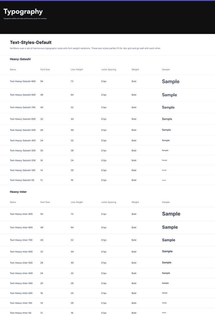
    • Typography: Fonts, sizes, and guidelines.

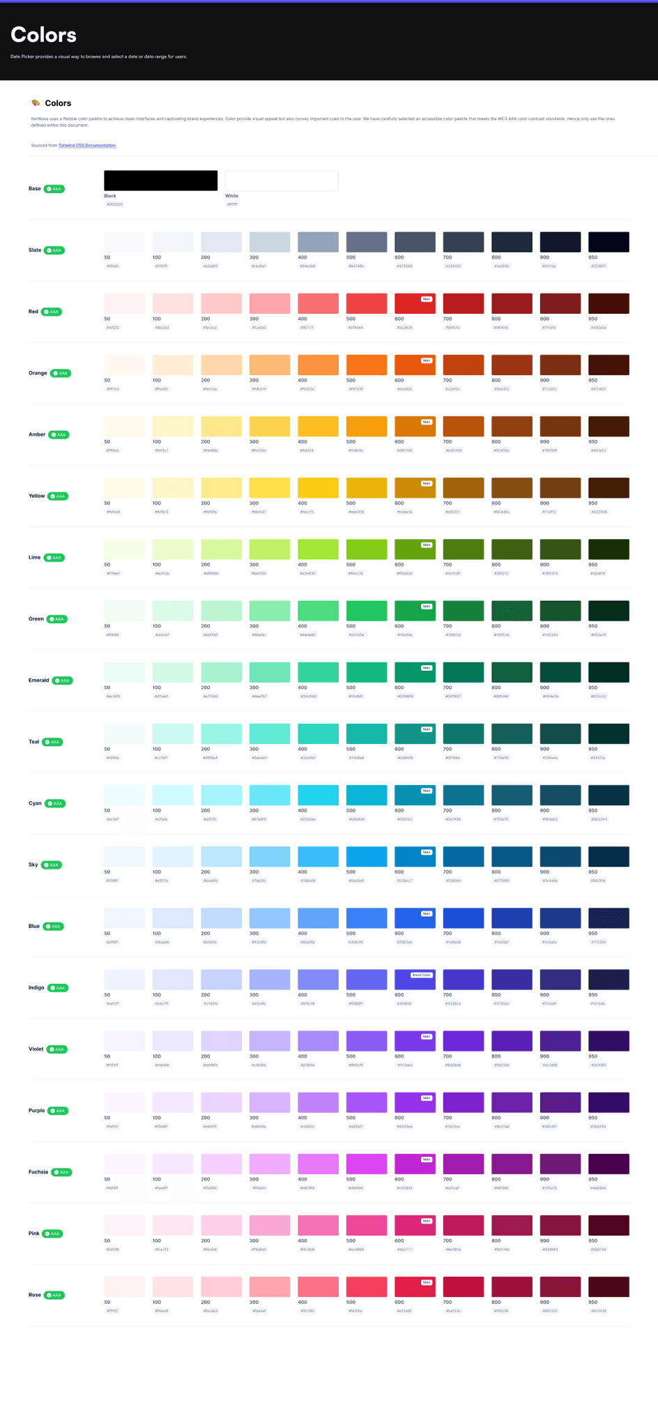
    • Color Palette: Primary, secondary, and neutral options.

    • Spacing & Layout: Grids, margins, paddings.

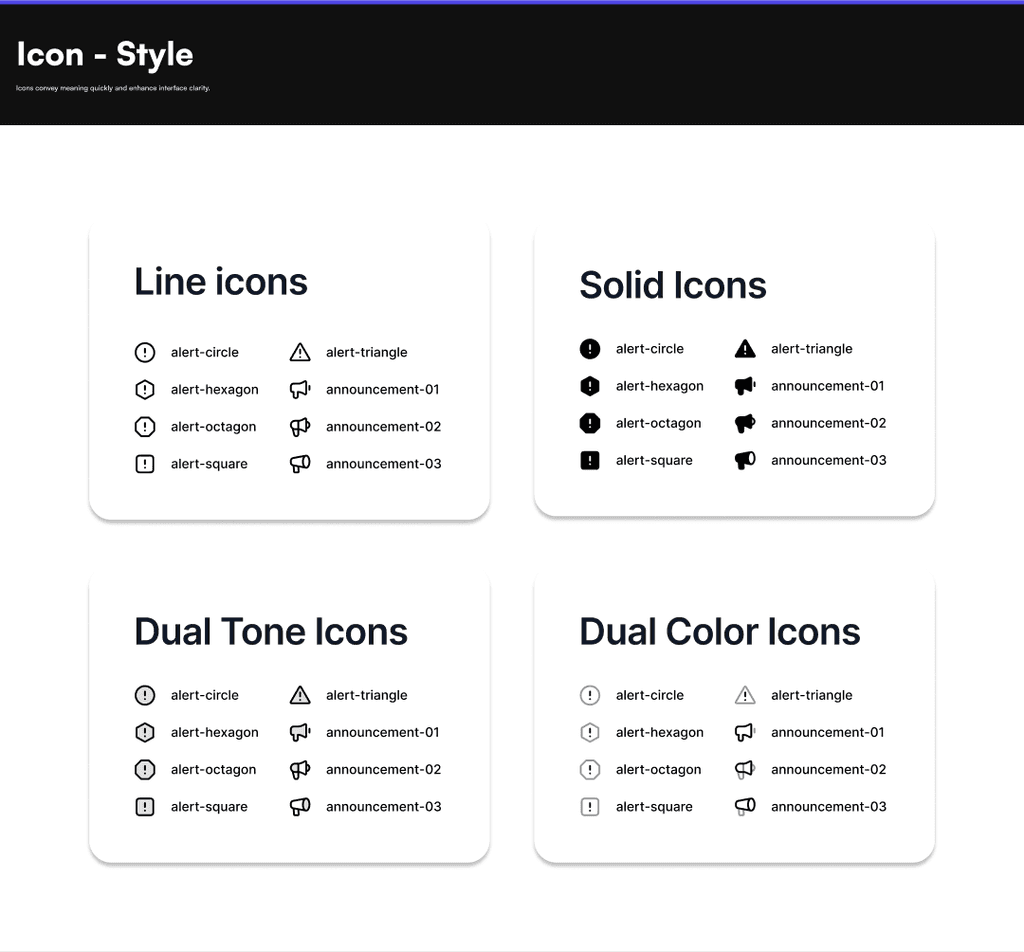
    • Icons & Illustrations: Consistent design assets.

    • Motion & Animation: Guidelines for transitions and micro-interactions.

  2. UI Components

    • Buttons, forms, navigation elements, modals, cards, tooltips, and more.

  3. Design Tokens

    • Standardized values for colors, typography, spacing, and more to bridge design and code.

  4. Design Patterns & Guidelines

    • Form structures, error validations, and accessibility compliance.

  5. Documentation & Implementation

    • Usage guidelines, Figma libraries, code implementation, and versioning for system evolution.

Scalability & Customization

The design system is built to accommodate any product requirement while allowing flexibility for individual product branding needs. By standardizing design elements while maintaining unique brand identities, we achieve both consistency and creative freedom.

Conclusion

A well-structured Design System is not just a UI framework—it’s a business enabler. By standardizing workflows, improving collaboration, and ensuring consistency across six products, this initiative will:

  • 🚀 Accelerate product development by reducing design redundancies.

  • 🎯 Ensure a seamless user experience across all products, improving brand perception.

  • 🤝 Enhance collaboration between designers, developers, and stakeholders.

  • 📈 Scale effortlessly as we expand our product portfolio.

By investing in a scalable, adaptable design system, our organization can drive efficiency, reduce inconsistencies, and deliver high-quality user experiences across all products. This system will serve as a single source of truth, ensuring faster development cycles, more effective stakeholder engagement, and a stronger, cohesive brand identity.

Create a free website with Framer, the website builder loved by startups, designers and agencies.